The Today view: is everything okay, in three seconds
The parent panel opens on one page, called Today, and it is built to be closed again quickly. Four blocks, top to bottom: what needs you, where they are, screen time so far, and alerts. On an ordinary Tuesday the first block is empty, both children are where you expect, the rings are half full and the alerts list says "nothing new". That is the whole check, and it should take about as long as reading this sentence.
Any browser · Same account in the parent app · Your child's phone shows that you looked

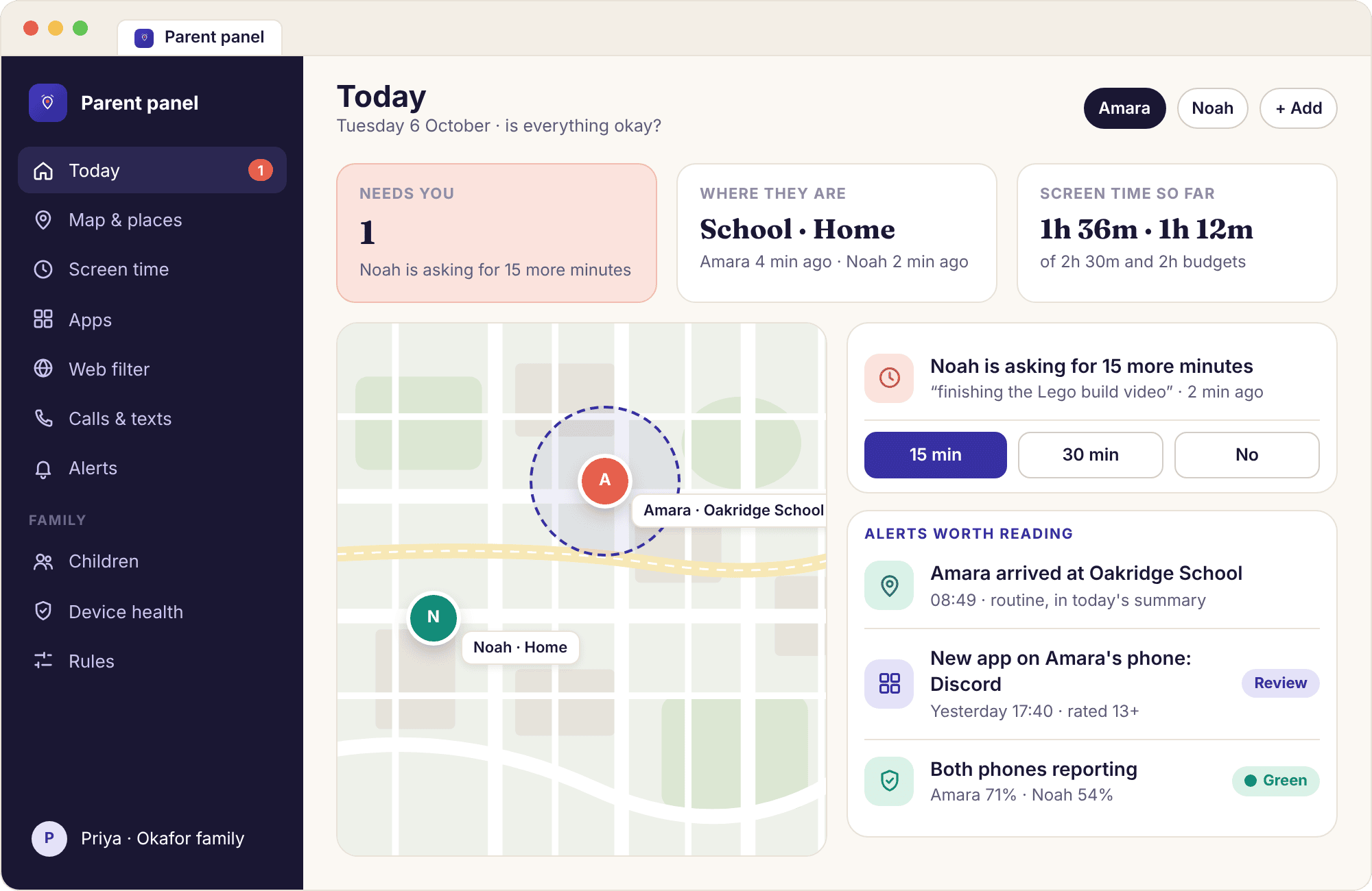
Today: four blocks in a fixed order, and the top one is usually empty
The order matters more than the design. "Needs you" sits at the top because it is the only block that asks for a decision: a request for more time, a request for an exception to a block, a task waiting for approval, a phone that has gone amber. When there is nothing, the block collapses to a single line, "Needs you: 0", and your eye drops to the next one. Below it, "Where they are" shows each child's current place by name and the time of the reading, then "Screen time so far" shows a ring per child, then "Alerts" lists anything new since you last looked.
Nothing on Today scrolls sideways, nothing auto-refreshes with animation, and nothing is sorted by how worrying it might be. The page is the same shape every day, which is what lets you read it without reading it. If Noah has asked for fifteen minutes, the top block is suddenly not empty, and that is the only thing that has changed about the page.
- One page, two devices. The Today view in the browser and the Today tab in the parent app are the same page drawn at different widths, with the same four blocks.
- Children, not features. Each block is grouped by child first. You read "Amara" and "Noah", not "location" and "screen time".
- It records that you looked. Opening Today counts as a panel visit, and the child's phone shows "a parent viewed the panel today" as a result.
The child card: one child, everything about them, nothing about anyone else
Click "Amara" anywhere on Today and you land on her child page. The top strip summarises the rules in force: a 2h 30m school-day budget, bedtime at 21:30, TikTok limited to 30 minutes, three web categories blocked. Under it, today's detail: the budget ring with the by-app bars that make it up, the places she has been with times, the alerts that concern her and only her, and her device health line, green at 71% with all six permissions granted. The same page has her rules in an editable form further down, so a change is one scroll away from the number that prompted it.
The point of the child page is that it answers "what is going on with Amara" without Noah's day mixed into it. Families with more than one child find that most of their time in the panel is spent here rather than on Today, because Today is for the three-second check and the child page is for the five-minute one.
- The rules strip matches their phone. What you see at the top of the child page is what Amara sees on her "What's shared" screen, generated from the same settings.
- History is one click down. The places list expands into the full day timeline, and from there into the rolling window of recent weeks.
- Deleting is here too. A child's history can be deleted from this page at any time, and removing the child altogether removes everything about them.

The map: both children, each reading dated, nothing older than it says
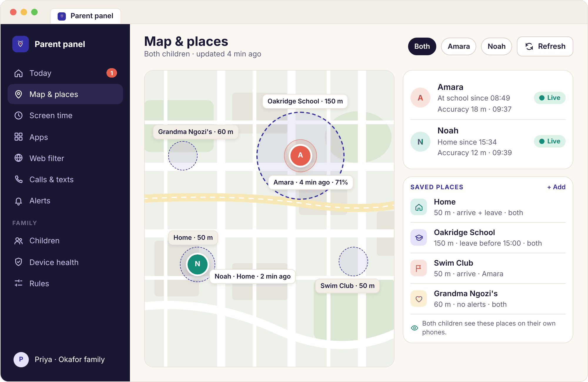
The map page shows every paired phone as a pin with the child's initial, the saved place it is in if any, the time of the reading and the accuracy circle around it. Amara at Oakridge School, 18 metres, four minutes ago; Noah at Home, 31 metres, nine minutes ago. The circle is drawn to scale, so an indoor reading that has drifted by forty metres looks like what it is, a wide guess, rather than a confident dot on the wrong building. A refresh button asks the phone for a new reading and tells you when it arrives.
The map on Today is a thumbnail of this page with the same two pins. It exists so that the question "are they where I expect" is answered without a click; the full map is for the days when the answer is no. Because the app reports where a phone settles rather than polling constantly, a pin that has not moved for an hour is normal during school, and the time next to it is the thing to read, not the position.
- Stale readings are labelled. A phone that has not reported for a while gets an amber banner with its last battery level and a link to device health, instead of a pin that looks fresh.
- Places are drawn on it. Saved circles for Home, Oakridge School, Swim Club and Grandma Ngozi's appear on the map so you can see whether a pin is inside one.
- The same map on their phone. A child can open their own location history on the child app and see the same stops you can.
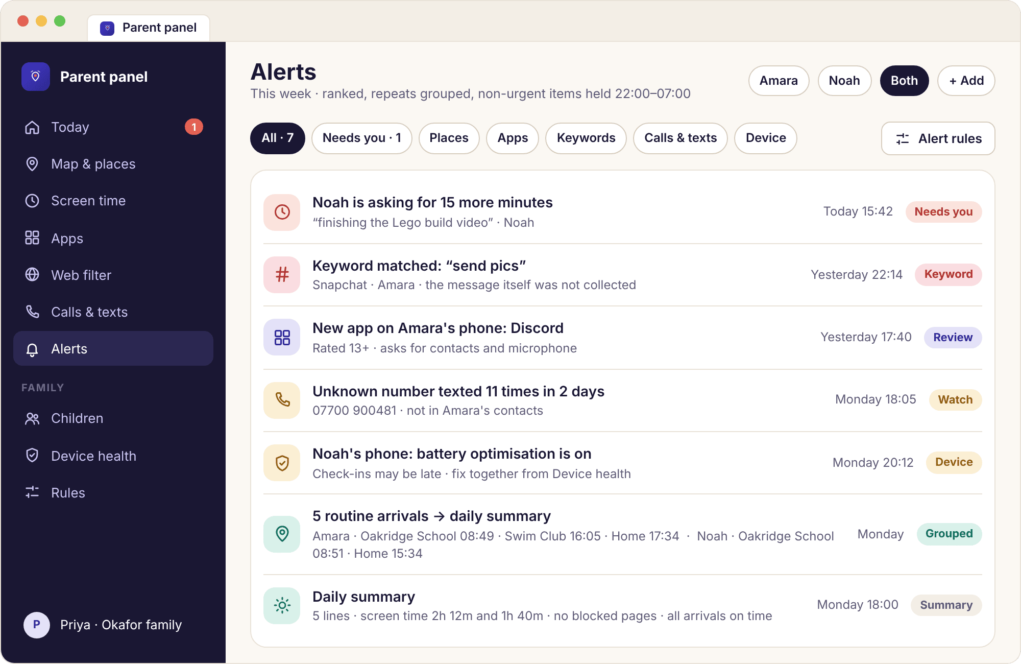
Alerts: a list you can filter, with repeats folded into one line
The alerts page is the full record behind the "Alerts" block on Today. Each line carries the child, the type, the time and a one-sentence summary: "Noah · New app installed · 16:42 · Discord, rated 13+". Filters along the top narrow it by child, by type (place, screen time, app, web, keyword, device) and by date. Routine arrivals at school and home are grouped into a single line per day rather than cluttering the list, and anything that arrived during quiet hours and was held is marked as held, with the time it would have interrupted you.
The Today block shows only what is new since you last opened the panel, so if you checked at 18:00 and look again at 21:30, you see the three events in between and nothing older. Marking an alert as read on the parent app marks it read in the browser too. Nothing here contains message text, page contents or anything typed, because none of that is collected; a keyword alert shows the word, the app and the time, and stops there.
- Each line links to its page. A place alert opens the map at that time; a screen time alert opens the child's budget; a device alert opens device health with the fix.
- Rules are set per type. Interrupt, summarise or stay silent, per alert type, from the alert rules page, so the list stays worth reading.
- Co-parents see the same list. Alerts are shared across everyone on the account, with read state kept per person.
What one parent's evening with the dashboard looks like, hour by hour.
The useful way to judge a dashboard is to count how many times it made you open it and how long each visit took. Here is one evening in the Okafor house with both numbers. Total time in the panel: under four minutes.
Nothing to open.
The departure from Oakridge School is a routine event after 15:00, so it goes into the daily summary rather than Priya's phone. The Today page records it under "Where they are" as "Left Oakridge School 15:31", but nobody is looking at Today at 15:31, and that is the intended outcome.
One notification, no visit.
Swim Club has an arrival alert, because Wednesday is the day Amara gets there by bus on her own. "Amara arrived at Swim Club · 16:05" arrives on Priya's phone as a single line. She reads it on the lock screen and does not open anything. Time in the panel so far: zero.
The three-second check.
Priya opens Today on her laptop while the kettle boils. Needs you: 0. Amara, Home, two minutes ago. Noah, Home, six minutes ago. Amara's ring at 1h 12m of 2h 30m, Noah's at 48m of 1h 30m. Alerts: nothing new. She closes the tab. Elapsed: about eight seconds, most of it the page loading.
Five lines, read once.
The summary card lands at 18:00: arrivals and departures for both children, Noah's new install from the afternoon (a drawing app, rated for everyone), Amara's most-used app today (WhatsApp, 41 minutes), and a note that both phones are green on device health. It takes twenty seconds to read and replaces four separate interruptions.
The one decision of the evening.
Noah's budget ran out mid-video and he sent a request: 15 minutes, note "finishing the Lego build video". It appears at the top of Today and as a notification. Priya taps 15 min on her phone without opening the panel. Noah's ring updates a few seconds later and the request disappears from Needs you. Total handling time: one tap.
The five-minute check, once a week or so.
Priya opens Amara's child page to check how the TikTok limit has been going. The by-app bars show 30 of 30 minutes used on four of the last five days, with a request for more declined once. The rules strip at the top shows the limit exactly as Amara sees it on her phone. Priya changes nothing, which is the usual outcome of this visit.
No visit needed.
Both phones wind down on their own schedules, Noah's first, because the bedtime lives on the phone and not in the panel. Today shows "Wound down 21:30" under each child when Priya glances at it the next morning. Quiet hours start at 22:00, so a routine alert after this point waits until 07:00.
Seen in the morning, deliberately.
A keyword matches a notification preview on Amara's phone: the word, Snapchat, 22:14. Keyword alerts are urgent by default, so this one would normally interrupt. Priya has set this particular word to summary, so it is held and appears on Today at 07:00 marked "held overnight", where she reads it before the school run.
Every section of the panel, what it is for, and how often you will open it.
The table covers the four blocks of Today and the six sections beside it in the left-hand navigation. Most families open two of those six regularly and the rest once at setup. This table is the honest version of the tour.
| Section | Answers | Typical use | Changes anything? |
|---|---|---|---|
| Needs you | Is there a decision waiting: a time request, an exception request, a task to approve, a phone gone amber. | Whenever it is not zero | Yes, one tap each |
| Where they are | Which saved place each child is in, or the nearest road, and when that reading was taken. | Every visit, in passing | No |
| Screen time so far | Minutes used against today's budget per child, with the by-app bars a click away. | Evenings | No (rules live on the child page) |
| Alerts | Everything new since your last visit, then the full filterable history. | Daily, briefly | Mark read; rules elsewhere |
| Children | One card per child with age, phone, health colour and a button to add another child. | Setup, then rarely | Add, rename or remove a child |
| Device health | A green, amber or red line per phone: battery, last check-in, missing permissions named exactly, battery optimisation. | When a map goes quiet | Send a fix-together prompt |
| Rules | Screen time, bedtime, app limits and blocks, web categories, keyword list and places, per child. | Setup, then every few months | Everything the child's phone enforces |
| Family access | Who else can see this account, with what role, and how to invite or remove a co-parent. | Once | Invite or remove people |
| Command log | Every change and remote action, with who made it and when: "Priya · Added 15 min · Noah · 19:10". | When two parents disagree about who set what | No, read-only by design |
| Account | Email, password, subscription, what each plan includes, cancelling, and closing the account. | Rarely | Billing and deletion |
What is not in the navigation: a messages viewer, a screenshots gallery, a camera button or a keystroke log. The panel shows what the child app collects, and the child app collects signals, never contents.
A dashboard you open twelve times a day is a dashboard that has failed.
The three-second question
Every block on Today exists to answer one question, "is everything okay", and the design test for the page was whether a parent could answer it before the kettle boiled. That constraint shaped everything. It is why the top block is a count rather than a list, why places are written as names and not coordinates, why the rings are drawn and not tabulated, and why the alerts block shows only what is new. A page that shows everything available is a page you have to read; a page that shows only what changed is a page you can glance at.
It also decided what Today leaves out. There is no week chart on it, no app ranking, no call list, no history trail. All of those exist, one click down on the child page or in their own sections, and all of them are for a different question: not "is everything okay" but "what has been happening". Keeping the two questions on two pages is what stops the first one taking five minutes.
Building the habit, not the compulsion
The failure mode of any family dashboard is a parent who checks it at every red light. The tools against that are the ones that bring information to you so you stop fetching it: arrival alerts for the places that matter, a daily summary at a fixed time, quiet hours overnight and requests that can be answered from a notification. Used together they mean most days need one deliberate visit, in the evening, and a glance at the summary.
A good first-month rule for the Okafors was that Today gets opened once after school and once before bed, and the child page gets opened on Sundays. Anything the panel needed in between, it asked for through a notification. If you find yourself opening the map at lunchtime on an ordinary Tuesday, the setting to change is probably a place alert on school, not your own willpower.
Set the summary time to when you actually sit down
The daily summary defaults to 18:00. If your evening starts at 19:30, move it, because a summary read in a hurry is a summary that gets ignored by week three, and a feed nobody reads in week six is the thing the smart alerts feature was built to prevent.
Two parents, one panel
Family access lets you invite a co-parent to the same account. They sign in with their own email and see the same Today, the same children and the same alerts, with their own read state so that one of you marking something read does not hide it from the other. Each rule and each remote action is stamped with the name of whoever did it, in the command log and on the child's block screen, so "who added fifteen minutes at 19:10" is never a mystery. A role setting lets an invited person see without changing, which suits a grandparent who minds the children on Fridays.
Separated parents use this in two ways. Some share one account and agree the rules together, with the log as the referee. Others keep separate accounts and pair the child's phone to one of them, because the child app pairs with a single account and one parent is responsible for the rules on that phone. Either works; what does not work is quietly changing a rule the other parent set and expecting the child not to notice, since the change appears on their "What's shared" screen the same afternoon with the author's name.
They know you looked
Opening Today, the map or a child page counts as a panel visit, and the child's phone shows "a parent viewed the panel today" for the rest of that day. It does not say which pages. The line is there so that monitoring stays something a child knows is happening rather than something they wonder about, and it changes how parents use the dashboard more than any other feature on this page. Once you know that your child will see that you looked, you check because there is a reason to, and the number of visits falls on its own.
Some parents ask whether there is a way to look without the line appearing. There is not, on any plan. The the child app page lists every screen the child can see, and that line is on it permanently.
What the dashboard cannot tell you
Today shows the shape of a day: where the phone was, how long it was used, which apps, which categories, which contacts and how often. It does not show what was said in any message, what was on the screen, what was typed, or what a photo contained, and no section of the panel ever will. A ring at 2h 30m tells you the budget is used, not whether the time was homework on YouTube or something else; the by-app bars narrow it, and a conversation closes the gap. A pin at Home tells you where the phone is, which is usually but not always where the child is.
The dashboard is also only as current as the phone's last check-in. A phone at 3% battery at 15:40 reports nothing until it is charged, and Today will say so with an amber line rather than a confident pin. Reading the time next to every number is the habit that stops a quiet phone looking like a quiet evening. When the map goes grey, device health is the page to open, and it names the cause more often than not.
What parents ask about the panel's Today view.
Do I need to install anything on my own phone to use the dashboard?
No. The parent panel is a website that works in any browser, on an iPhone, an Android phone, a laptop or a tablet. The parent app is optional and uses the same account; it adds push notifications and one-tap answers to requests. Many parents use the app on their phone and the browser on a laptop, and both show the same Today page.
How often does the Today page update?
Each block updates when the child's phone checks in, which is when it settles somewhere new, when screen time changes or when an alert fires. Reloading the page shows the latest readings, and the time next to each one tells you how fresh it is. The map has a refresh button that asks the phone for a new position and tells you when it arrives.
Can I see both children on one screen?
Yes. Today shows every child under the account, each with their own place, ring and alerts, and the map shows all of their pins together. Each child has a separate child page for the detail, and a switcher in the parent app moves between them. Nothing about one child ever appears on another child's phone.
Will my child know when I open the dashboard?
Yes. On any day you open Today, the map, a child page or the parent app, the child's phone shows "a parent viewed the panel today". It does not say which pages or how long. There is no way to switch this off, on any plan, because it is part of what makes the app visible rather than hidden.
Can I change a rule directly from Today?
Requests can be answered from Today with one tap, and remote actions such as adding fifteen minutes or pausing a phone are a click away. Editing a rule itself, such as a budget or a blocked app, happens on the child page or the rules section, so that a change is made next to the full picture rather than in a hurry from a summary.
What does the "Needs you" block include?
Anything waiting for a decision from a parent: a request for more time, a request for an exception to a blocked app, a task marked done and waiting for approval, and a phone whose device health has gone amber or red. When there is nothing waiting it shows "Needs you: 0" and takes up one line. It never includes routine events such as arrivals.
Can a co-parent see the dashboard too?
Yes. Invite them from Family access and they sign in with their own email to the same Today page, children and alerts. Their changes are stamped with their name in the command log and on the child's block screens. A view-only role is available for someone who should see but not change anything.
Does the dashboard show messages, photos or what was on the screen?
No, and no section of it ever will. The child app collects the shape of activity, meaning names, times, durations, categories and counts, and never contents. A keyword alert on the dashboard shows the matched word, the app and the time, and the message it came from is never sent off the child's phone.
What happens on the dashboard when a phone stops reporting?
The child's card on Today turns amber, the map pin is labelled with the time of the last reading and the last battery level, and the device health line names the likely cause, most often battery optimisation or a flat battery. You can send a fix-together prompt to the child's phone from there. If the app has been removed, the line turns red with a tamper alert.
Where the dashboard fits with everything else
Today is the front door to the rest of the panel, so the pages that explain what sits behind each block are the child app, device health, multiple children and setup and pairing guide.
Signing in, creating an account and opening the read-only demo of the Okafor family all happen on the parent panel page, and the demo is the fastest way to see Today with a full week of data in it.
The Today view switches on once your child's phone is paired with your account, which takes about ten minutes with both devices on the table. The download and setup guide walks through every screen.
See the whole house on one page, then close it.
Pair a phone, give it an afternoon, and the Today page fills in by the evening with the four things worth knowing and nothing else.
Android · Free account · Visible on your child's phone