The child app: what your child sees, screen by screen
Most parental-control marketing shows you the parent's side and keeps quiet about the other phone. This page does the opposite. It walks through every screen MobileTracking puts on your child's Android phone, from the consent screen they read before anything is collected to the line that tells them you opened the panel today. If you are deciding whether to install it, this is the half of the product your child will judge you by.
Android 8.0 or later · Its own icon in the app drawer · No hidden mode, on any plan

The child app is a small app, and that is deliberate.
It has a home screen, a consent screen, a transparency screen and a request button. Everything else is a notice or a checklist. A child can learn the whole thing in the time it takes to pair the phone, and there is nothing left over to be suspicious about.
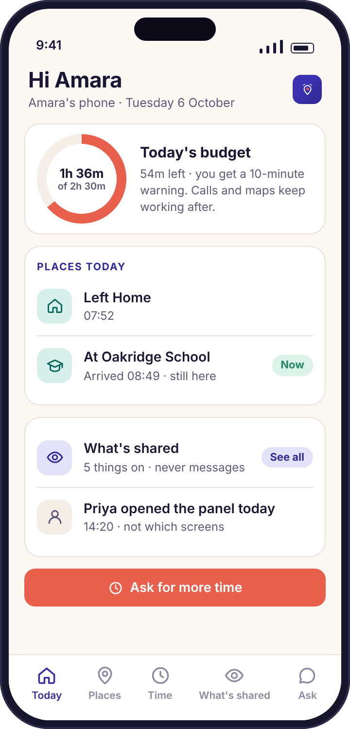
The home screen says their name and what today looks like
Open the app on Amara's Galaxy A35 and the first line is "Hi Amara". Under it sits today's screen time budget as a ring, with minutes used and minutes left, then the places her phone has been today, written as "Oakridge School 08:49 – 15:31" rather than as a map of dots. Two buttons finish the screen: "What's shared", which opens the transparency list, and "Ask for more time", which opens the request screen. That is the whole home screen. There is no feed, no streak counter, no badge to earn, because the app is not trying to be opened often.
The budget ring is the part children look at most, and it is the same number Priya sees on her phone, updated at the same time. When Amara has 54 minutes left, both phones say 54 minutes. If the two ever disagree it is because one phone is offline, and the child app says so with a small "last updated" time under the ring instead of pretending.
- Nothing to set up on this screen. The child cannot change limits or places here. They can see them, which is the point, and ask about them.
- The places list is theirs too. The same stops and journeys a parent sees in location history appear on the child's phone, with the same saved place names.
- Rules are named with a person. Each limit on the home screen carries "set by Priya", so a rule is never an anonymous decree from an app.
The consent screen comes before a single reading is taken
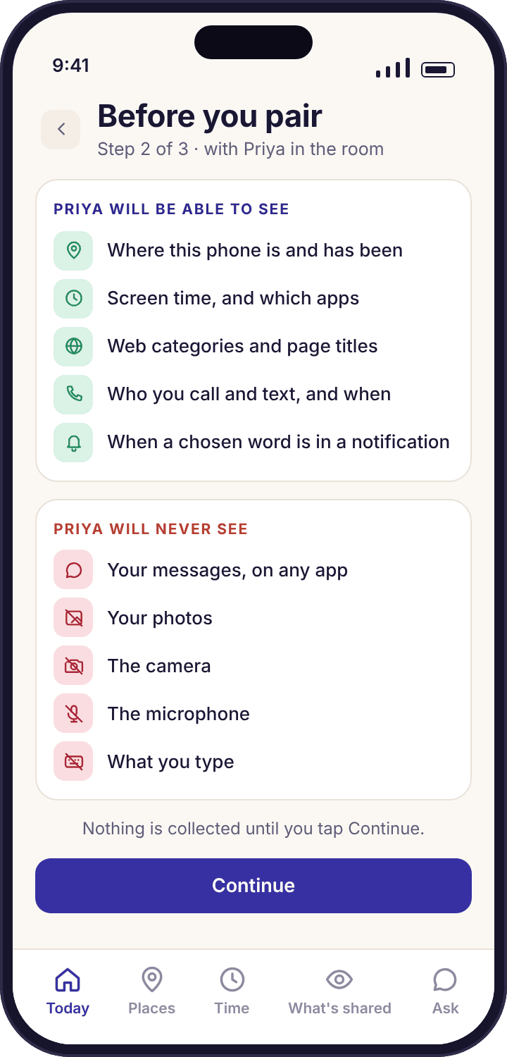
After the six-character pairing code is accepted, the app does not start collecting. It shows a two-part screen headed with the parent's first name: "Priya will be able to see" above one list and "Priya will never see" above another. The first list names where the phone is, how long each app is used, which websites categories are visited and, on the APK build, who is called and texted and when. The second list is the one most parents forget to mention when they explain the app themselves: not the words of any message, not photos, not the camera or microphone, not what is typed.
Nothing on this screen is collapsible or skippable. The Continue button sits under both lists, and until the child taps it no permission has been requested and no reading has left the phone. If they hand the phone back and say they want to talk about it first, the pairing simply waits. The code expires in about fifteen minutes and a new one takes ten seconds to make, so there is no cost to pausing.
- Read it aloud together. The screen is written for a nine-year-old to follow. Noah can read it himself; Amara will want to, and should.
- It is not a contract. A child tapping Continue is agreeing to be told, not signing away anything. The legal responsibility sits with the parent, as the terms of service make clear.
- It cannot be bypassed from the panel. No button on your side completes pairing without this screen being tapped on the phone.
"What's shared" is a permanent list, not a one-time notice
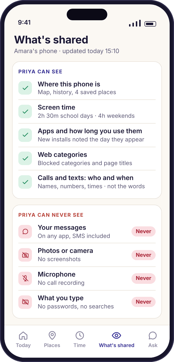
The consent screen is a snapshot of the day the phone was paired. The transparency screen is the living version. It lists every feature that is on right now, with a tick, and every feature that is off or does not exist, with a cross. Location, screen time, app activity, web categories and calls and texts sit at the top as ticks when they are on. Messages, camera, microphone and typing sit at the bottom as permanent crosses, because the app has no way to collect them on any plan.
Under the feature list come the specifics: each saved place by name and radius, each daily budget for school days and weekends, each per-app limit, each blocked app and its schedule, each web category that is blocked, and the keyword list if one is set, shown as a count of words rather than the words themselves. When Priya adds a 30-minute TikTok limit from the panel at lunchtime, the line appears on Amara's transparency screen that afternoon. There is no setting that makes a rule invisible to the child it applies to.
- Same list on both sides. The panel's rules page for Amara and Amara's "What's shared" screen are generated from the same settings. One cannot say more than the other.
- Changes are announced. A new or changed rule shows a small "new" marker for a day so a child notices what moved.
- History is visible too. Tapping Location opens the same timeline the parent sees, so "where was I on Tuesday" has the same answer on both phones.
"Ask for more time" turns a limit into a conversation
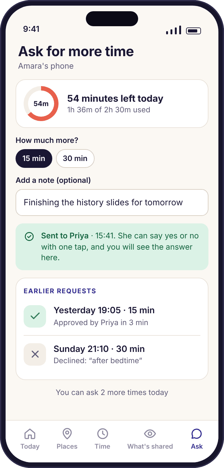
Ten minutes before the budget runs out, the child's phone shows a banner. When it does run out, games and video pause, and the "Ask for more time" button stays on the home screen. Tapping it opens the request screen: pick 15 or 30 minutes, add an optional note, and send. Noah's note on a Wednesday read "finishing the Lego build video", which is more information than most parents get from a shout up the stairs. The screen then shows "Sent to Priya" and waits.
On the parent's phone the request appears at the top of the Today view as something that needs you, with one-tap answers. Approve, and the minutes land on the child's ring within a few seconds; decline, and the child sees a plain "Not today" with no further explanation from the app, because the explanation is a parent's job. A daily cap on requests, which you set, stops the button becoming a nagging tool at 21:30.
- Calls and maps keep working. When time runs out, phone calls, the dialler, maps and anything on the "always allowed" list are untouched. A paused budget never strands a child.
- Nothing is collected from the note. The note goes to the parent as typed and is not analysed, matched or stored beyond the request.
- No limit, no button. A newly paired phone starts with no budget, so this button does nothing until a parent sets one.
Every screen the child app can show, and when it shows it.
There are fourteen. If you want to know exactly what your child will encounter on their phone, this is the list to read before you install, and it is the list to show them on the day you do.
Six boxes for the pairing code from the panel. Shown once, at setup, with the parent in the room. A mistyped code gets a plain "That code didn't match" rather than a lock-out; the usual culprit is a zero typed as the letter O.
The "Priya will be able to see / will never see" lists with a single Continue button. Shown once, after the code is accepted and before any permission is requested. Nothing is collected until it is tapped.
Six rows, one per Android permission, each with a tick once granted and a short line saying which feature it powers. Shown during setup and again from the home screen whenever one is missing, so a child can see why, say, the map stopped.
"Hi Amara", today's budget ring, the places visited today, the "What's shared" and "Ask for more time" buttons. The screen the app opens to every time after setup.
The transparency list: active features with ticks, impossible ones with crosses, then every place, budget, limit, block and category in force. Updates the same day a parent changes anything. Always reachable from home.
The same timeline of stops and journeys the parent sees for the day, labelled with saved place names. Reached by tapping Location on the "What's shared" screen. Read-only on both sides; only a parent can delete it.
"1h 36m used · 54m left today" with a ten-minute warning banner before the budget ends. Appears over whatever the child is doing at the ten-minute mark, once, and can be dismissed.
Pick 15 or 30 minutes, add a note, send. Then "Sent to Priya", followed by either the extra minutes on the ring or "Not today". Shown only while a budget is set and the daily request cap has not been reached.
"Phone sleeps in 12 minutes · alarm and calls still work", shown before a scheduled bedtime. Because the bedtime schedule lives on the phone, this screen appears on time even with no signal.
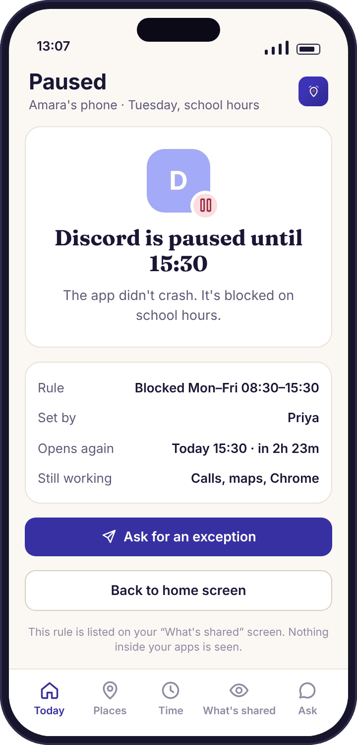
"Discord is paused until 15:30 · rule set by Priya · Ask for an exception". Shown when a blocked app is opened. It names the rule, the person and the end time; it never imitates a crash or a missing app.
"This page is in the Gambling category · blocked by your family's rules · Ask Priya". Shown in the browser when web filtering stops a page, with the category named so the child knows what tripped it.
The optional chores and reading list, with minutes attached, a "Done" button per task and a "waiting for approval" state. Only present if a parent has switched tasks and rewards on. No photo proof is ever asked for.
"Priya asked you to switch battery optimisation off · Open settings". Sent from the device health page when a phone has stopped checking in. One tap opens the right Android settings screen; the child does the rest.
A single line on the home screen, shown on any day a parent signed in to the panel or opened the parent app. It says that someone looked, not which screens, and it cannot be switched off from the panel.
Not on the list, because they do not exist: a hidden launcher, a disguised icon, a switch that makes the app invisible, a screenshot viewer or a message reader. If another product shows you a child app with any of those, it is not describing the same kind of software.
Four rules the child app keeps, whatever a parent sets.
These are not settings. They are the parts of the app you cannot change from the panel, and they are what make the rest of it workable in a house with a teenager in it.
Visible by design, with its own icon
The app sits in the app drawer under its own name with the beacon logomark, appears in Android's app list and battery screen, and shows up in the recent-apps view like anything else. A child who looks for it finds it in two seconds. We will not add a hidden mode, on any plan, at any price, because software that hides from the person it monitors is a different product with a different name, and the name is stalkerware.
The same list on both sides
The parent's rules page and the child's "What's shared" screen are two views of one set of settings. If a limit exists, both can see it; if a feature is off, both can see that too. This is also why the app cannot read messages, take screenshots or switch on the camera: a feature the child could not be shown on their own phone is a feature we do not build.
Changes are announced, not slipped in
Adding a place, tightening a budget or blocking an app updates the transparency screen the same afternoon, with a "new" marker beside the changed line. A rule a child discovers by bumping into it feels like a trap. A rule they saw arrive, with a parent's name on it, feels like a rule. The marker costs a parent nothing and saves most of the arguments.
They can push back, and the app helps them do it
"Ask for more time", "Ask for an exception" and "Ask Priya" are built into the screens where a rule bites, not buried in a menu. Every one of them sends a short request to the parent and shows the child it was delivered. The answer is still the parent's, but the channel is always open, and a child who can argue through the app has less reason to work around it.
A blocked app says who blocked it, and until when.
Open Discord on Noah's Pixel 7a during school hours and a plain screen covers it: "Discord is paused until 15:30 · rule set by Priya · Ask for an exception". Three facts, one button. Compare that with the other way of blocking an app, where it silently fails to open or shows a fake error, and the child spends ten minutes reinstalling it or deciding the phone is broken. An honest screen ends the confusion in one glance and, more usefully, it tells Noah exactly when he can try again, so he stops trying before then.
The same shape covers every kind of block. A web page stopped by web filtering names its category. An app over its per-app limit says "TikTok's 30 minutes are used up today". A phone past bedtime says the alarm and calls still work. None of these screens can be dismissed into the app behind them, and none of them pretend to be something else. The Android Accessibility permission is what lets the app draw these screens; without it, apps and sites can be counted but not blocked, and the permissions checklist on the phone says so plainly.
- "Ask for an exception" is a real request. It reaches the parent as a one-tap approve or decline, like a request for more time, and the child sees the answer on the same screen.
- Always-allowed apps never show it. Calls, the dialler, maps and whatever you add to the always-allowed list open normally during a block or a paused budget.
- The rule's author is always named. If a co-parent set the block, their name is on the screen, not yours. The command log in the panel keeps the same record.
The app explains itself on the phone, but the first conversation is still yours.
Three scripts, because a nine-year-old and a fifteen-year-old need different sentences. Each one is short on purpose. Say it, then hand them the phone with the "What's shared" screen open and let them read.
Say what it does, in the order they will meet it.
"This app shows me where your phone is, how long you've been on it, and it will tell you when your time is nearly up. It can't read anything you write and it can't see your screen. You can see everything it shows me, on this page." For Noah that was enough; he was more interested in the budget ring than the rest.
- Show the ten-minute warning before it happens for real
- Let them tap "Ask for more time" once, so they know what it does
- Keep the places list to home and school at first
Lead with what it cannot do, because that is what they will ask.
"It doesn't read your messages, on WhatsApp or anywhere. It can't see photos or your camera. What it does see is on this screen, and if I ever change anything you'll see a 'new' marker here the same day. If you think a rule is wrong, the app has a button to tell me, and I'll answer." Amara's first question was about Snapchat, and the crosses on the transparency screen answered it.
- Go through the "will never see" list line by line
- Agree the budget together before you set it, not after
- Point out the "a parent viewed the panel today" line and explain it
Make it an agreement with an end date.
"I'd like location and screen time on for now, and nothing else. Here's the full list so you can check I'm not quietly adding things. We'll look at it together every couple of months and take things off as we go." At this age a rule that never loosens is the rule that gets the app uninstalled, and the app will tell you when that happens rather than fighting it.
- Start with fewer features on than you think you want
- Put a review date in both your calendars
- Remove things in the open, so the transparency screen shrinks visibly
What parents ask about the app on the child's phone.
Can my child see that MobileTracking is installed?
Yes, always. The app has its own icon and name in the app drawer, appears in Android's settings like any other app, and opens to a home screen with their name on it. There is no hidden mode and no disguised icon on any plan. A child who is told nothing will still find it within a day, which is why we suggest telling them first.
What does the child app show about what I looked at?
One line on their home screen: "a parent viewed the panel today". It appears on any day you sign in to the panel or open the parent app. It does not say which screens you opened, how long you looked or whether it was you or a co-parent. The line cannot be turned off from your side.
Can my child change or switch off a rule from their phone?
No. Every screen on the child's side is read-only apart from the request buttons. They can see every limit, place, block and category, and they can send a request about any of them, but changes are made only in the parent panel or the parent app. A child who wants a rule changed has to ask, and the app gives them the button to do it.
Does the child app stop my child from removing it?
Not entirely, and it does not try to. If it is removed, collection stops immediately and you receive a tamper alert naming the phone and the time. With the device-admin permission granted, removal takes several deliberate steps rather than one long press, but it is still possible. The app does not hide from uninstallation and does not reinstall itself. Treat a removal as a signal to talk, not a fault to patch.
Does the child app drain the phone's battery or slow it down?
It is built to be light: it reports where the phone settles rather than polling constantly, and it does no screenshots, recording or scanning. Most of the day it is idle. You can see each phone's battery level on the device health line, so if the cost looks higher than a few percent a day, something else on the phone is usually the cause.
Does my child need an account or an email address?
No. The child app is paired to your account with a six-character code typed on their phone. It stores their first name and date of birth, which you entered in the panel, and nothing else about them. There is no child login, no password for them to forget and no email sent to them.
Can a child use the app to see a sibling's information?
No. Each paired phone sees only its own screens: its own budget, its own places, its own history and its own rules. Amara's phone shows nothing about Noah's. Only the parent account and any invited co-parent see both children side by side.
What if my child declines the consent screen?
Pairing does not complete and nothing is collected. The code expires in about fifteen minutes and you can make a new one whenever you are both ready. We would rather you install a day later with a child who read the screen than the same evening with one who was rushed past it.
Is the child app different on the Google Play build and the APK build?
The screens are identical, with one difference in the transparency list: on the Google Play build the "calls and texts" line shows a cross, because that build has no call or SMS log access under Google Play policy. On the direct APK build it shows a tick when the feature is on. Everything else, including every "never" line, is the same.
Where the child app fits with everything else
The child app is one half of a pair, and the other half is the parent panel, so it helps to read this page alongside the family dashboard, device health, multiple children and setup and pairing guide.
If the phone ever stops checking in, the fix-together prompt described above is sent from the device health page, and the APK install guide explains the one build difference that changes the transparency list.
The child app switches on once your child's phone is paired with your account, which takes about ten minutes with both devices on the table. The download and setup guide walks through every screen.
Install it with the phone in their hands, not yours.
Pair it together, read the consent screen aloud, and leave them with the "What's shared" screen open. Ten minutes, and nothing on their phone they have not seen.
Android · Free account · Visible on your child's phone